Role
- Illustrator
- Brand Designer
- Web Designer
Challenge: Designing Personality for a Digital Storefront
The original website was a hodgepodge of branding materials without cohesion. As a new store, 45th Parallel Wines had no digital guidelines or personality to distinguish it from other Portland wine shops. The site lacked core features:
- No social media connection, such as an Instagram feed to generate awareness.
- No clear call‑out for the curated wine delivery program.
- A refined and updated “About” page to establish identity in the St. John’s neighborhood.
- No events page to showcase community programming (local art exhibitions, weekly live music).
The store needed a digital presence that communicated it was more than a wine shop — it was a community hub.

Analysis and Insights
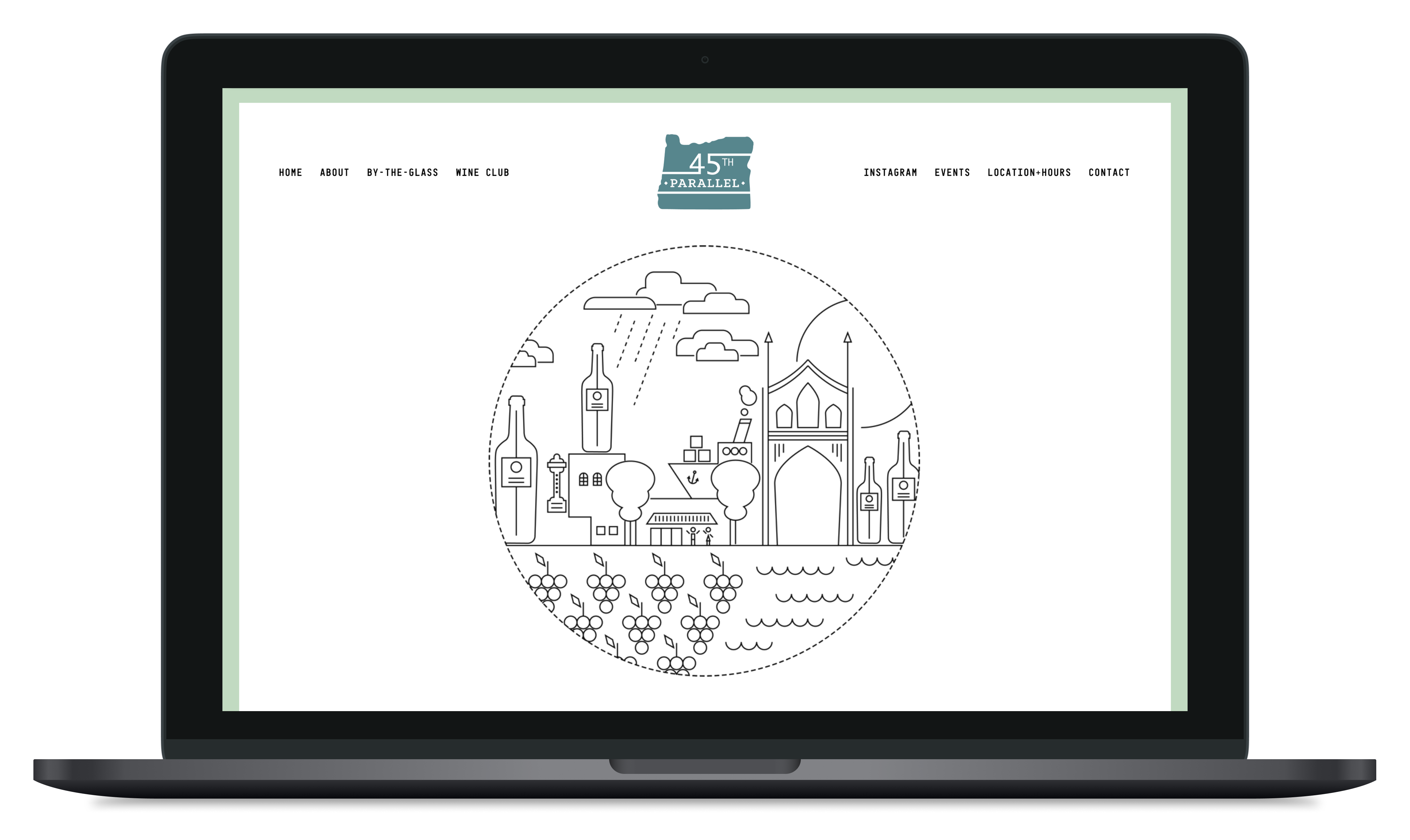
Through client conversations and moodboards, I identified that the brand’s strength lay in its local geography and community programming. The absence of a cohesive identity meant the store’s unique role as a cultural hub wasn’t visible online. My insight: the digital storefront needed to root itself in St. John’s landmarks and community rituals to differentiate from competitors and resonate with locals.
Solution
- Brand System: Developed a logo, typography, and color palette to give the store a distinctive personality.
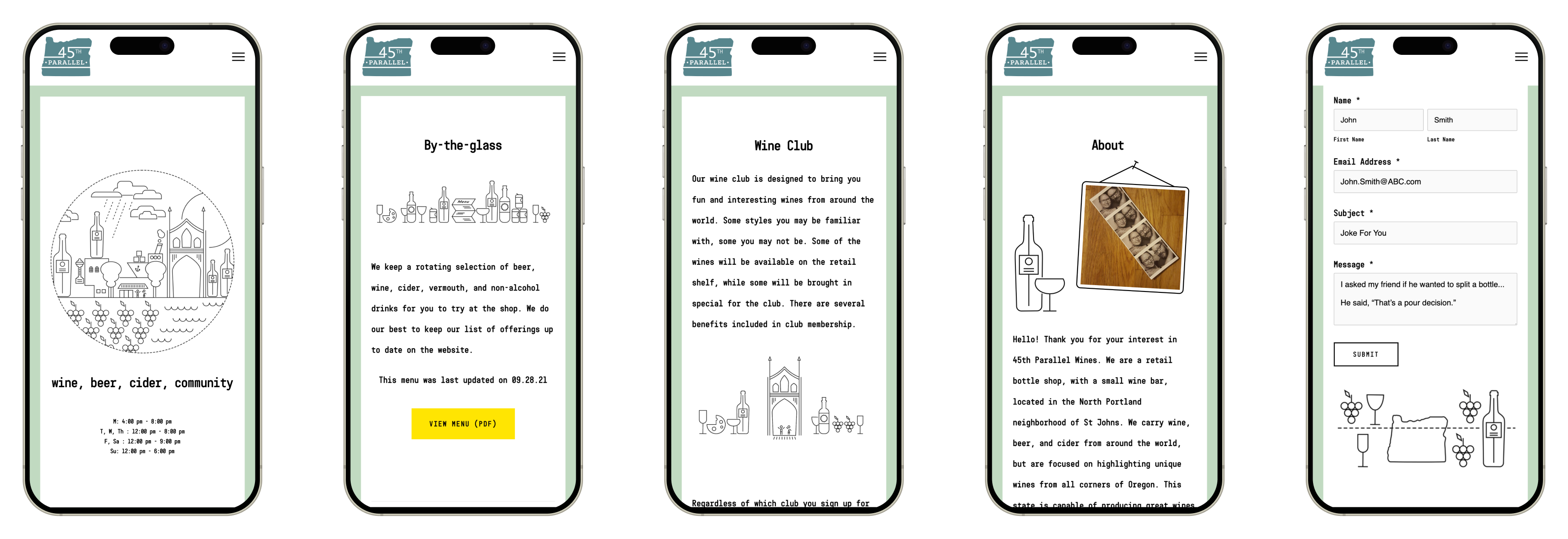
- Custom Illustrations: Created flat‑design illustrations referencing St. John’s bridge and streetscapes, embedding a sense of place.
- Responsive Design: Built layouts optimized for desktop, tablet, and mobile.
- Community Features: Added Instagram integration, curated delivery program call‑outs, About page, and Events page highlighting art shows and live music.
- Scalable Assets: Designed an extensible illustration system (thin‑line, geometric stick‑figure style) adaptable to banners, social media, packaging, and signage.
- Technical Tailoring: Applied CSS tweaks to ensure the Shopify template felt bespoke rather than generic.


Impact
- Established a cohesive digital identity that differentiated 45th Parallel Wines from other Portland wine shops.
- Elevated the website as another digital marketing tool for the store’s role as a community hub, showcasing events and local art alongside wine offerings.
- Increased brand awareness through Instagram integration and storytelling rooted in geography.
- Delivered a scalable design system that continues to support growth across digital and physical touchpoints.